
When it comes to food branding, standing out on the shelf is just as important as the product inside the jar. That’s exactly what The Pickle Pantry needed—a bold, retro-inspired identity that would be instantly recognisable, full of personality, and utterly irresistible to pickle lovers.
At Pixel Punch Design, we crafted a complete brand identity, including a logo, packaging, illustrations, social media templates, and a colour palette to bring The Pickle Pantry to life. Let’s dive into the creative process behind this juicy, briny masterpiece!
Before jumping into design, we started with in-depth brand research to determine the right visual direction for The Pickle Pantry. A solid brand identity doesn’t happen accidentally—it’s built on strategy, research, and a clear understanding of the target audience.
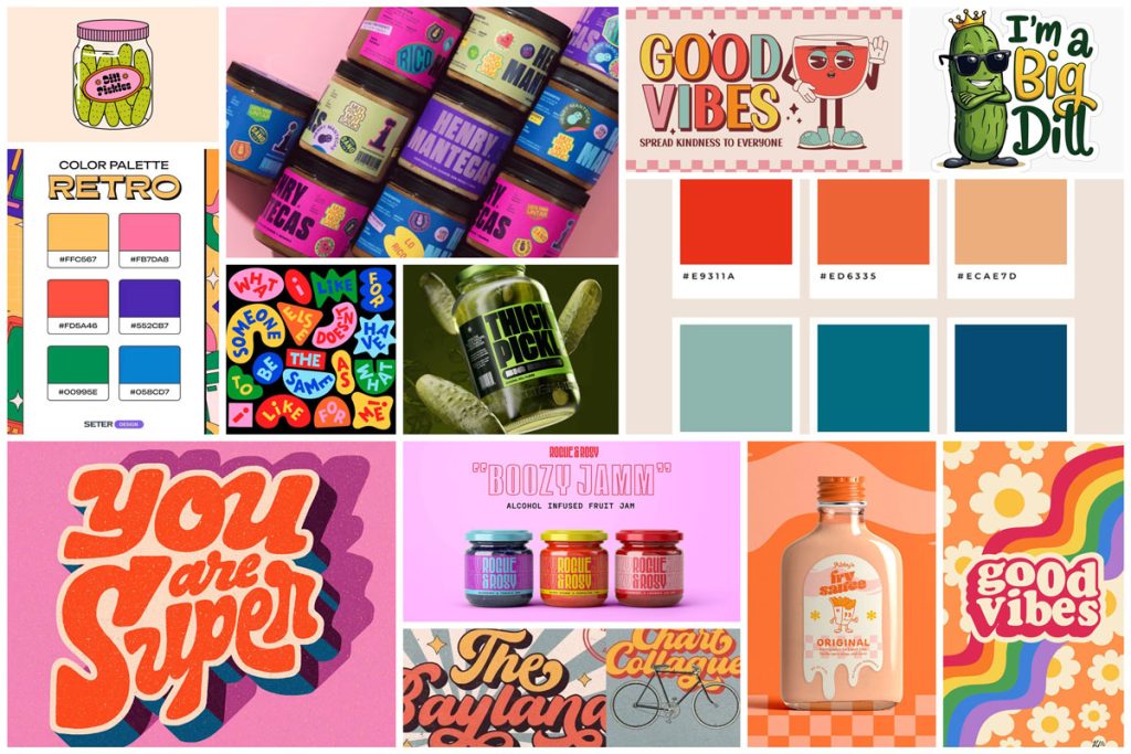
The moodboard played a crucial role in defining the overall aesthetic. It pulled together elements from:
This foundation ensured every design choice was aligned with the brand’s unique personality: vibrant, bold, and unapologetically fun!
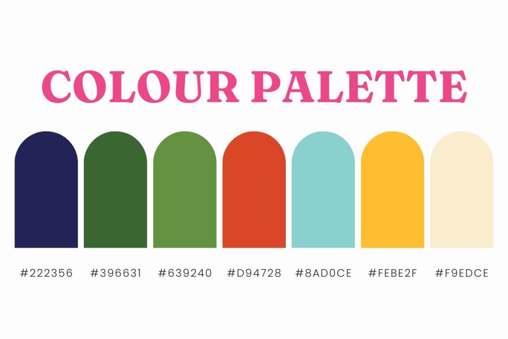
The colours for The Pickle Pantry were carefully chosen to evoke nostalgia while feeling fresh and modern.
Golden Mustard & Spicy Red: These warm, inviting tones add vintage charm and bring energy to the design. They’re inspired by classic food packaging from the mid-century era.
Cool Turquoise: This refreshing blue-green hue provides contrast, making the warm tones pop. It also adds a slightly unexpected, unique twist.
Crisp White & Deep Green: Used as accents to keep the design balanced and ensure clarity in typography and illustrations.
These colours create a strong shelf presence, ensuring that The Pickle Pantry products are eye-catching, fun, and instantly recognisable.
The Pickle Pantry’s logo was designed to feel nostalgic but fresh, drawing inspiration from vintage signage and classic food branding.
Why This Logo Works for The Pickle Pantry
Bold typography with a retro twist – The letterforms have character, giving the logo a slightly vintage but approachable aesthetic.
Playful yet structured – The balance between fun and professionalism ensures the brand feels both high-quality and inviting.
Versatility across packaging and marketing – The logo remains clear and readable, whether on a small social media post or a full-size jar label.
By combining these elements, we created a recognisable and engaging brand identity that feels both familiar and exciting.
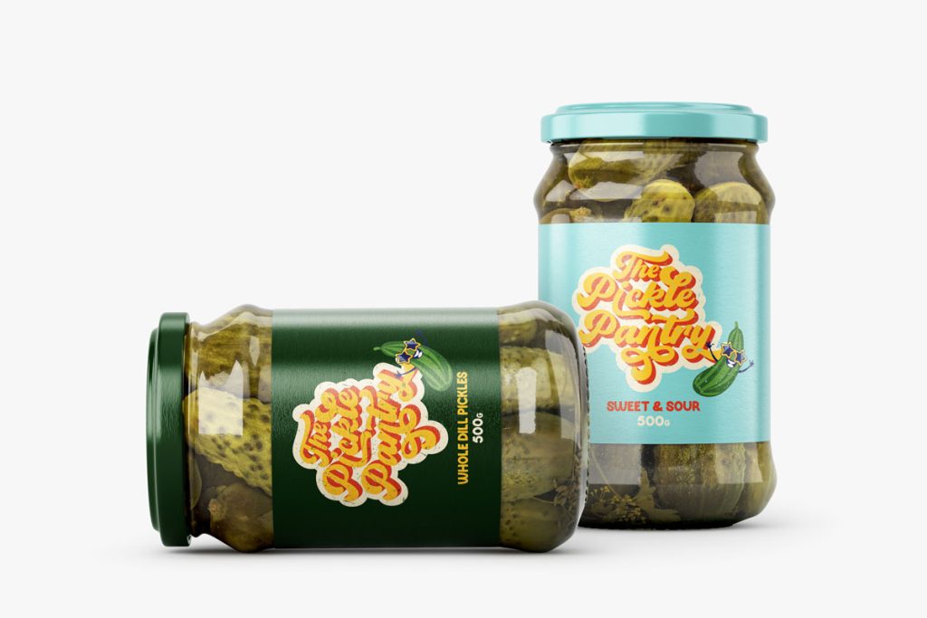
One of the standout features of The Pickle Pantry’s branding is its adorable illustrated pickle character. This mascot adds personality and makes the brand instantly recognisable.
Why Use a Mascot?
The illustration style follows a bold, cartoonish aesthetic with clean lines and expressive details, making it adaptable across different applications, from packaging to social media.
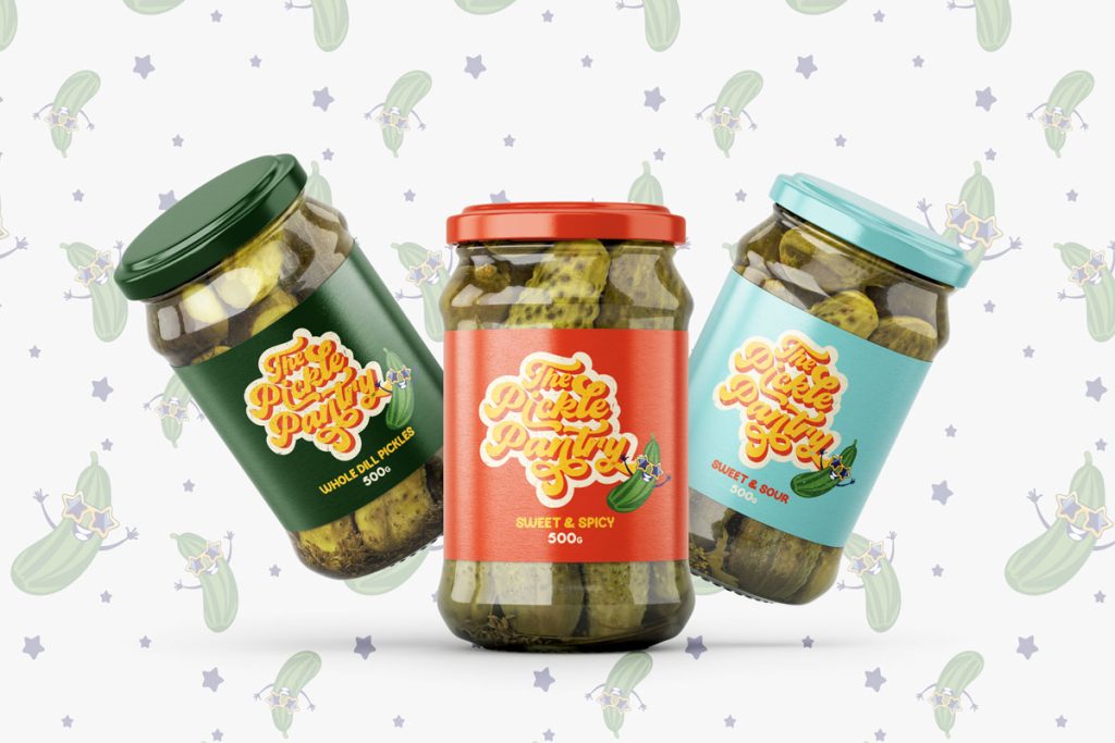
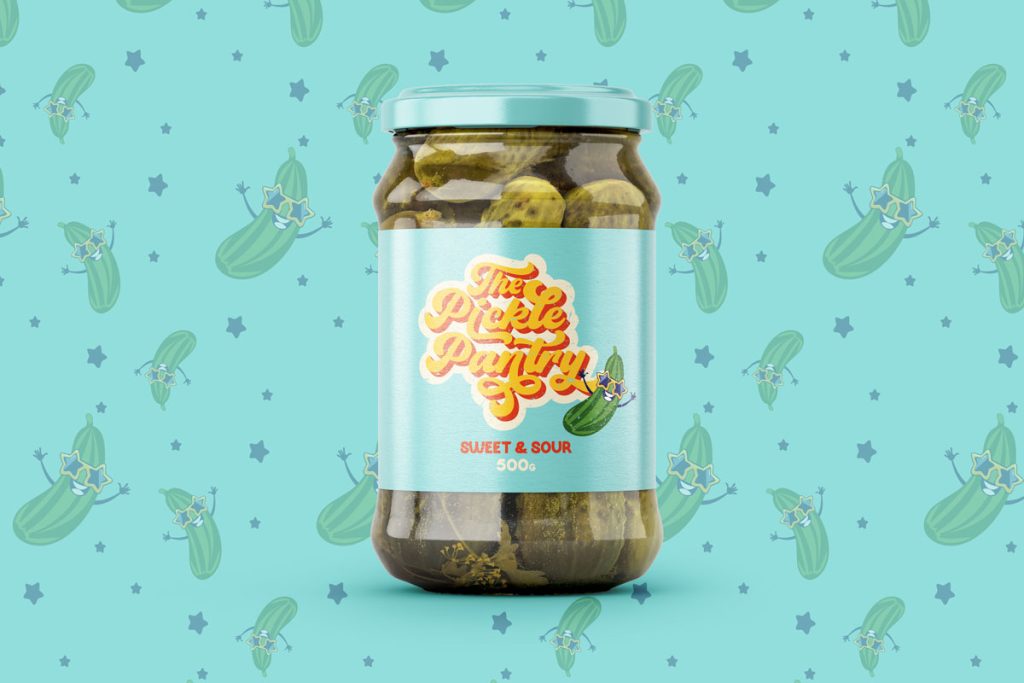
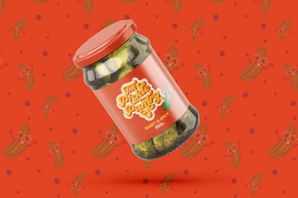
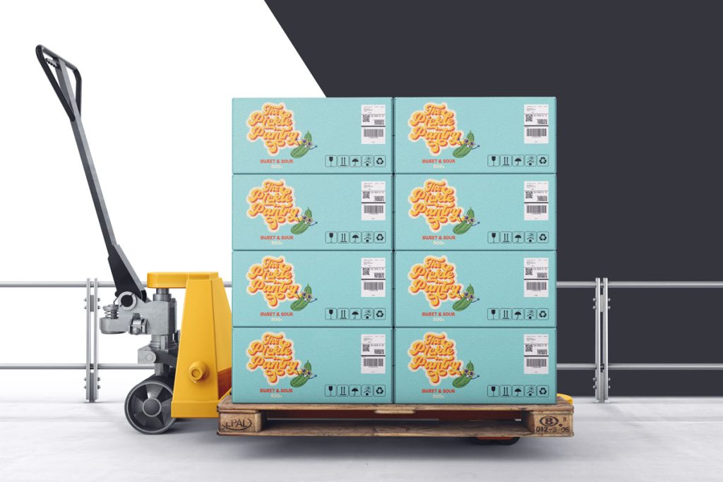
Great branding doesn’t stop at the logo—the packaging design is just as crucial.
For The Pickle Pantry, we created eye-catching jar labels that make the product look as delicious as it tastes.
Key Packaging Features:
The goal was to create packaging that demands attention and encourages impulse buys, ensuring The Pickle Pantry jars are the first ones customers reach for.
A strong brand identity extends beyond packaging—it also needs to work seamlessly in the digital space. We developed custom social media templates and marketing assets that allow The Pickle Pantry to maintain brand consistency across all touchpoints.
This ensures that the branding remains cohesive, fun, and memorable whether customers see The Pickle Pantry on a store shelf, Instagram post, or promotional ad.
The Pickle Pantry branding package included:
This project was a dream to work on. It blended bold creativity, strategic branding, and playful energy into a seamless, unforgettable identity.
Food brands have a unique opportunity to connect with customers emotionally through their branding. The Pickle Pantry is proof that a well-crafted identity can elevate a product, make it more desirable, and build brand loyalty.
By combining vintage nostalgia, bold colours, playful illustrations, and strategic design choices, this brand is ready to stand out in the market and capture customers’ hearts (and taste buds).
Thinking of refreshing your brand? Let’s create something bold, fun, and unforgettable!
We use cookies to improve your experience on our site. By using our site, you consent to cookies.
Websites store cookies to enhance functionality and personalise your experience. You can manage your preferences, but blocking some cookies may impact site performance and services.
Essential cookies enable basic functions and are necessary for the proper function of the website.
These cookies are needed for adding comments on this website.
Statistics cookies collect information anonymously. This information helps us understand how visitors use our website.
Google Analytics is a powerful tool that tracks and analyzes website traffic for informed marketing decisions.
Service URL: policies.google.com